
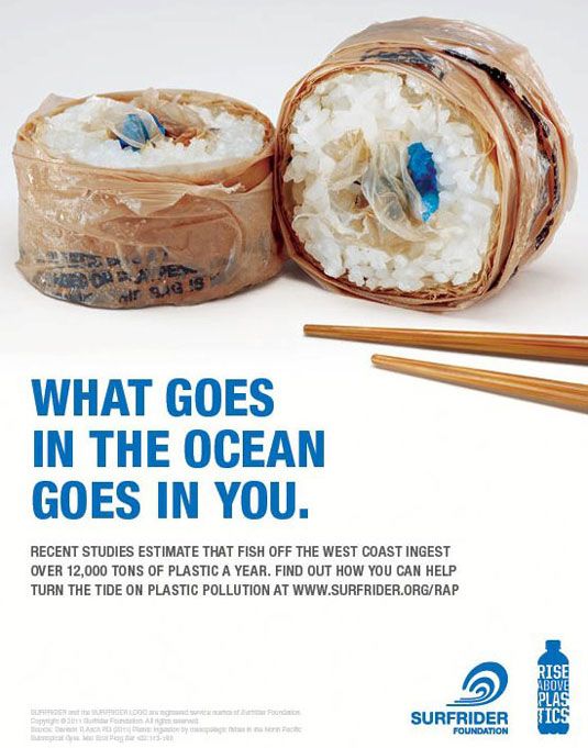
Introduction
This advertisement was created by Pollinate Agency based in Portland, Oregon for Surfrider’s Rise Above Plastics program in the beginning of 2012. The Pollinate Agency is a digital/graphic design agency who other foundations and companies hire to design logos and advertisements for them. I came across a different advertisement for Surfrider on Twitter a few days ago and did a little more research which led to their website and this specific advertisement. I used the Reverse Engineer Process to analyze this ad to pick out the various design elements that brought it together.
You can read more about the foundation and how you can help stop the pollution of our oceans here: http://www.surfrider.org/coastal-blog/entry/new-rise-above-plastics-print-psas-from-pollinate. Surfrider’s main goal is the protection of our oceans from plastic and other waste pollution, so we can enjoy our beaches, but also so our marine life can too.
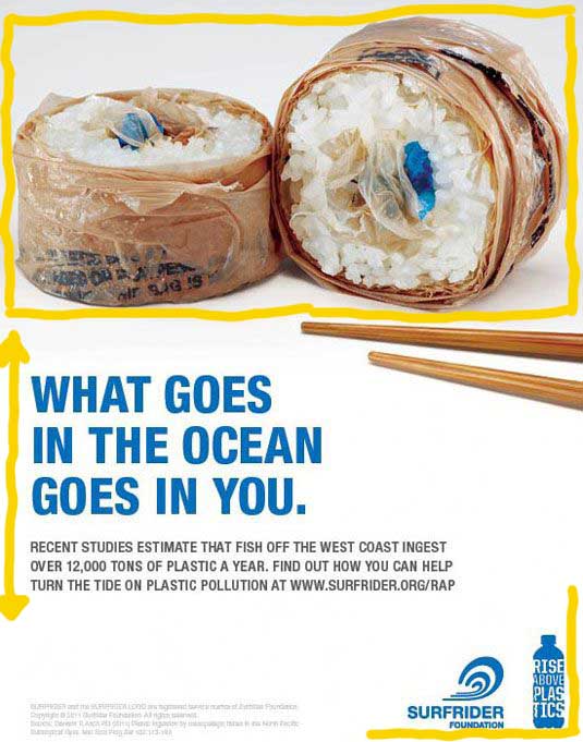
Repetition
This advertisement uses the repetition of two’s in order to make a statement and to express uniformity. For example, there are two foundation logos in the bottom right hand corner, two groups of text in the middle of the ad, the pair of chopsticks, and the two pieces of waste sushi at the top. The use of two’s is symbolic in the way that there is action and consequence. We may not notice it immediately, but everything we do affects someone, something, or somewhere. In this case, it’s our waste habits and how it’s affecting our oceans.
Contrast
The bright blue and brown against the bright white background create a eye-catching design. This draws our eyes to the important information and pictures displayed to get a point across our minds. The bright blue text stands out against the white background to catch out attention with a bold statement about human behavior.
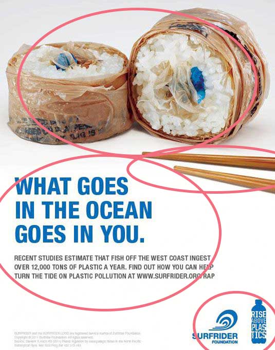
Alignment
Every aspect of this advertisement is aligned in one way or another. The foundation logos are aligned in the bottom right corner, the two groups of text in the middle are left-aligned, and the two pieces of waste sushi are centered at the top of the ad. This alignment allows the eye to travel to the different aspects of the ad, traveling from the sushi, then to the chopsticks, and then to the bottom of the text to the corner where the foundation logo’s are.
Color
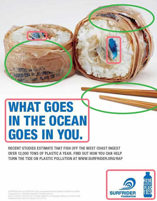
The use of a bright blue against the white and brown in the text, logos, and in the waste sushi itself represents the ocean and the blue that it’s supposed to be. With the blue being a bright, primary color, the brown being a neutral, the blue stands out since it’s the only real use of color in the advertisement. “What goes in the ocean goes in you” is in blue, grabbing our attention first, and our emotions.
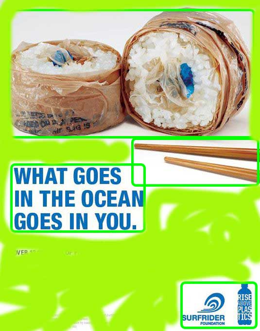
Proximity
The text is closely grouped together, to bring attention to the most important information in the ad, “What goes in the ocean goes in you”. The foundation logos are grouped together in the bottom right corner to show which foundations and programs were involved in publishing the ad and raising awareness. The waste sushi and chopsticks and grouped together at the top to show the waste in the ocean that collects after we consume something.
Conclusion
All the design elements used in the advertisement were crucial in helping raise awareness for water pollution and what we can do to help by creating an eye catching presentation about the dangers of pollution. The Pollinate Agency did a great job creating this ad for the Surfrider Foundation, and ultimately helped contribute to the cleaning of our oceans and protection of our marine life. We can all do something to help, whether its physically going to the beach to pick up trash, trying to live zero waste lifestyle, or even donating to the cause.
